Getting traffic to your website takes a lot of time, money, and consistent marketing effort. You might be running targeted social media ads, investing heavily in search optimization, or sending out weekly email campaigns to a subscriber list. Yet driving traffic is only half the battle. If visitors arrive at your site, get confused, and leave within three seconds, every dollar you spent getting them there is wasted.
This is why dedicated landing pages are the backbone of any profitable digital marketing strategy. A homepage introduces your overall brand, but a targeted destination page focuses on turning that incoming interest into sales, leads, or booked calls.
If your current conversion rates feel lower than they should be, fine tuning the layout of your site can make a huge difference. Here is a guide to the best modern practices that will help turn passive visitors into paying customers.
What is a Landing Page Conversion?
Before optimizing your layouts and copy, it helps to be clear about what a landing page conversion actually is.
In digital marketing, a conversion occurs whenever a visitor completes the specific action that a page was built to achieve. That action changes depending on your business model and the purpose of your campaign. For an ecommerce brand, a conversion means an immediate product purchase. For a software company, it might be signing up for a free trial. For a local service provider, a conversion is often a completed quote request form or a direct phone call.
The conversion rate is calculated by dividing the total number of successful actions by the total number of visitors to that page, then multiplying that number by one hundred. If one thousand people land on your page and forty of them fill out your contact form, your conversion rate sits at four percent. Tracking conversions accurately allows you to evaluate your marketing return on investment, identify user friction points, and make data-backed improvements over time.
What Makes a Good Landing Page?
Now that we understand the goal, the next natural question is: what makes a good landing page?
The simplest answer is clarity and focus. A traditional homepage acts as an open directory, offering navigation menus, about pages, company histories, blogs, and external links. In contrast, an effective promotional page has a singular focus, and a distinct call to action.
Every word, image, and form field on that page exists solely to guide the reader toward making one specific decision. When you remove outside distractions and speak directly to the visitor’s primary problem, conversion rates rise naturally.
Let’s explore the core best practices that make this happen.
1. Craft a Clear, Benefit-Driven Headline
Your headline is the first thing people read, and it makes or breaks whether they stick around. Research consistently shows that most visitors scan a headline within two seconds to decide if they are in the right place. If your message is confusing, clever without substance, or filled with vague buzzwords, people exit the page immediately.
A strong headline doesn’t just describe what your product is; it clearly states what your product does for the customer. Keep the headline clear and direct, and pair it with a supportive subheadline that expands on your primary offer in plain language. If you are running pay-per-click ads, make sure the exact phrase used in your ad matches the headline on the page so visitors know instantly that they landed in the right spot.
2. Match User Intent with a Single Call to Action
One of the quickest ways to ruin the performance of landing pages is giving people too many choices. When you present someone with five different links, three buttons, and a social media feed, you introduce decision fatigue. When people are overwhelmed with choices, they usually choose nothing.
Stick to one primary call to action across the entire page. If the goal is getting people to book a consultation, every button should say “Book a Consultation” or “Schedule Your Free Call.” If your page is relatively long and requires several scrolls, repeat that same button throughout the content. Keep the design, color, and wording of the button consistent from top to bottom so when a visitor decides they are ready to act, they never have to search around the screen to find the next step.
3. Strip Away Unnecessary Site Navigation
While your standard website needs a complete header navigation bar, footer menus, and utility links, your landing page functions much better without them. When a visitor arrives from a specific promotional campaign, you don’t want them clicking away to read your latest company news, check your careers board, or browse random blog categories. Every external link on that page serves as a distraction from them converting.
Remove the top navigation bar entirely and keep the footer minimal, featuring only necessary links such as your privacy policy and terms of service. By closing these escape routes, you gently keep the visitor focused on reading your pitch and evaluating your offer.
4. Show Real Value Above the Fold
The term “above the fold” refers to the screen space a visitor sees immediately when arriving on your site before they start scrolling down. While people are perfectly comfortable scrolling on mobile devices and desktop screens, that initial screen real estate still holds the highest visual attention.
Make sure your primary purpose sits within this initial view. Position a bold headline that names your main benefit along with a supporting subheadline. Pair these with high quality visuals, a bright contrasting call to action button, and a quick trust signal such as a rating badge or customer review snippet. If a visitor never scrolls another inch down the screen, they should still fully understand what you are selling, why it matters, and how to get it.
5. Keep Forms Short and Low Friction
Every additional input field you add to a lead generation form reduces the likelihood that someone will complete it. While your sales team might love knowing a prospect’s annual revenue, company size, physical mailing address, and timeline, asking for all of that upfront creates user friction.
Ask only for the bare minimum information needed to initiate contact. For an email newsletter or downloadable guide, an email address is usually plenty. For a service inquiry, asking for a name, email, phone number, and a brief message gives you everything you need to follow up effectively. If you genuinely need complex details to qualify leads, consider breaking the process into a multi step form, as asking for low commitment answers on step one before asking for contact info on step two often results in higher completion rates.
6. Use Genuine Social Proof to Build Trust
Visitors are naturally skeptical when encountering a new business online. They want to know if you can actually deliver on your promises and whether other people have had positive experiences with your company. This is why incorporating social proof is essential for modern landing pages.
Integrate authentic customer reviews, video testimonials, case study metrics, and third party trust badges from platforms like Google. When using customer quotes, include real names, job titles, and photos whenever possible. Specific testimonials that describe a clear before and after result carry more weight than generic praise, reassuring potential customers that choosing your business is a good decision.
7. Write Concise, Benefit-Centric Body Copy
No one wants to read walls of dense text. Online readers are scanners who look for quick information that addresses their immediate needs. Format your copy into short paragraphs containing two to three sentences each, and use bold text strategically to highlight crucial takeaways.
Instead of listing twenty technical features in abstract language, translate each feature into a tangible everyday benefit for the user. Explain how your product saves them time, cuts their costs, and eliminates stress, so the real world value is immediately obvious.
8. Prioritize Lightning Fast Page Load Speeds
Even the most persuasive copy and visuals will fail if your website takes too long to load. Internet users are extremely impatient, and studies regularly show that as page load times climb from one second to three seconds, the bounce rate increases significantly.
A slow page destroys your conversion rate before the user even gets a chance to see your headline. To keep performance sharp, optimize and compress all images, avoid bloated third party tracking scripts, use modern caching strategies, and host your assets on clean, responsive servers. A fast page not only keeps potential customers around, but it also improves your quality scores when running search ad campaigns, lowering your cost-per-click.
9. Design with a Mobile First Mindset
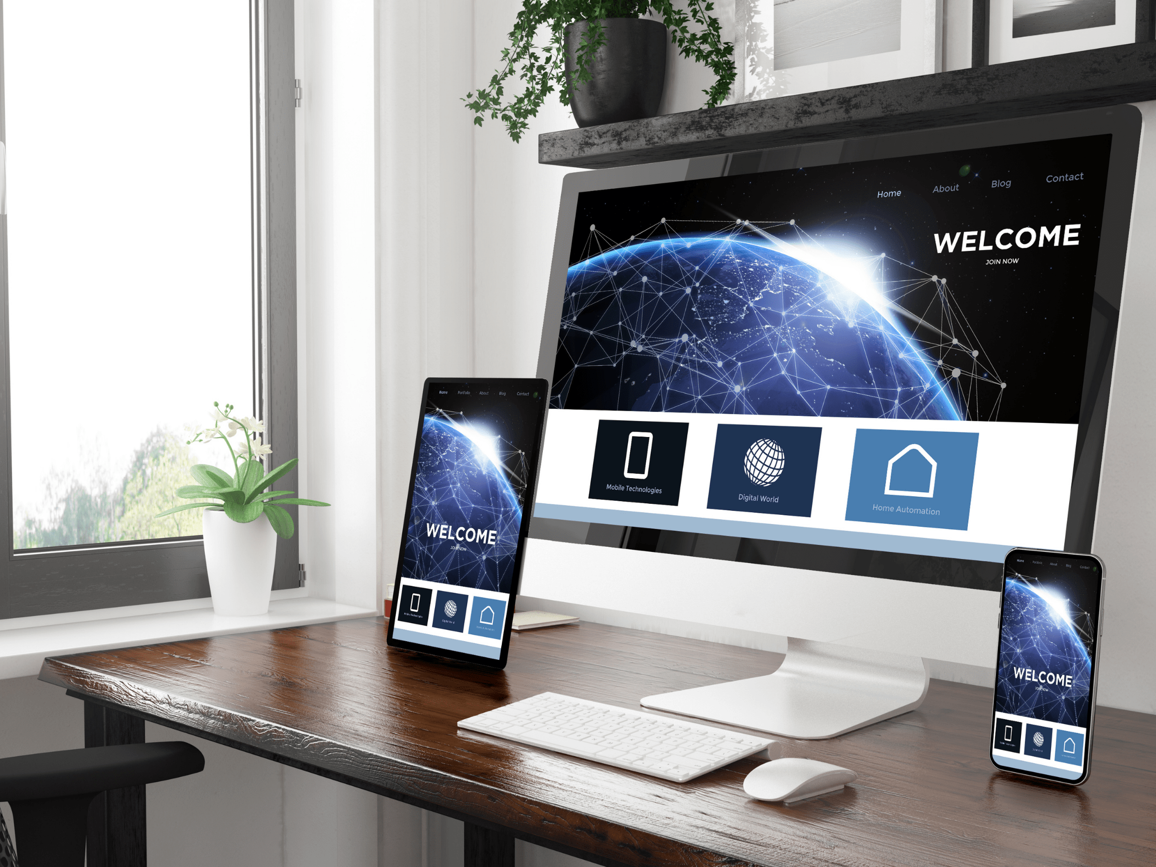
A massive portion of paid and organic web traffic now comes from smartphones and tablets. If your promotional pages are designed exclusively for desktop computers and are squeezed down for mobile, your mobile visitors will run into awkward spacing, unreadable fonts, and clunky forms.
Make sure your layouts are fully responsive and built with touch navigation in mind. Make sure text remains readable without zooming, make buttons large enough to tap easily, and keep form fields wide on small screens. Testing your pages thoroughly across multiple mobile devices and before launching any marketing campaign ensures the user journey stays effortless.
10. Run Continuous Split Tests to Learn What Works
Creating a high converting digital asset is rarely a one time thing. Consumer preferences change, markets shift, and what works for one product might not for another. The most successful marketing teams treat conversion optimization as an ongoing practice.
Use split testing tools to pit two variations of a page against each other. You can test an emotional headline against a straightforward headline, experiment with different button colors and action phrases, or adjust the number of required form fields to find the right balance between lead volume and lead quality. Only test one major variable at a time so you know which change caused the shift in user behavior.
Scale Your Online Conversions with Graphem Solutions
Driving qualified traffic to your website is an expensive, competitive process. Letting that hard won traffic slip away because of confusing layouts, slow loading speeds, or buried contact forms is a missed opportunity for your business.
Partnering with an experienced team makes all the difference when it comes to turning traffic into conversions. At Graphem Solutions, we build custom digital experiences, intuitive interfaces, and web applications tailored directly to your commercial goals. Our team combines thoughtful user experience design with high performance development to ensure your visitors turn into lifelong customers.
Contact our team today to share your project vision and find out how our team can help grow your business online.